Saturday, October 31, 2015
Lab 9 Bivariate Choropleth Mapping
The data for a bivariate map must be normalized like a regular choropleth map. In this case obesity and physical inactivity are percentages of county population. The data must then be broken into classes. Choropleth maps with more than 9 classes are confusing and hard to read. Data for this map was divided into 3 classes which produced a 9 class bivariate map. Created by Ray Eslinger in Nassau County Fl.
Lab 8 Analytical Data
I incorporated what we learned this semester with color,
typography, and balance to layout my infographic. I chose two complementary colors purple and
green for my two data frames. I used color
brewer to easily get similar saturation and lightness levels. I chose green as the background color for the
infographic and used my darkest purple from my obesity color ramp as the font
color. I placed the data frames with the
obesity and diabetes levels in the center to establish the hierarchy. To balance the infographic I placed
supporting information to the sides. I
used the darkest purple and green from my color ramps for the chart
colors. I used a single sans serif font
of various point sizes for the typography.
Created by Ray Eslinger in Nassau County Fl.
Thursday, October 8, 2015
Lab 6 Choropleth Mapping
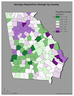
This lab had us making a choropleth map of population change in Georgia. I first normalized the data by determining the percent of gain or loss for Georgia's County's populations. I then chose the complementary colors of purple and green to use with a diverging color ramp. I created a basic legend showing the data classes created with natural breaks. Created by Ray Eslinger in Nassau County Fl.
Subscribe to:
Posts (Atom)


